JOHN ALCORN: A SORT OF HOMECOMING – JOHN ALCORN: UNA SPECIE DI RITORNO A CASA

JOHN ALCORN: A SORT OF HOMECOMING
Text by Stefano Scalich
[The author wishes to thank Stephen Alcorn and Marta Sironi at the University of Milan for the precious cooperation on this feature]
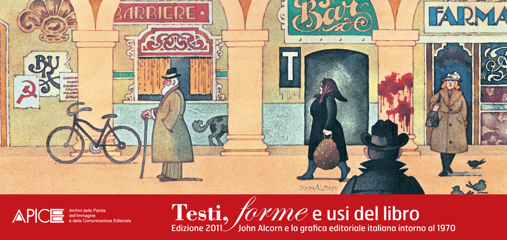
50 years after the publication of Books! and 20 after his death (January 27th, 1992) here’s an overview of John Alcorn and his own art. Part exploration, part tranche-de-vie, part fast-paced adventure, this play in three acts will lead you into the fascinating discovery of how Italy became (for the second time) home to the oeuvre of a remarkable American artist and book designer.
Act I
A long way
It was both moving and curious to witness firsthand the audience of several dozen long-standing fans of the artist who used to design, illustrate and paint while listening to the likes of Bach, Mozart, Vivaldi on the one hand, and Bob Dylan, the Beatles, Otis Redding, Sam Cooke, Odetta and the Band on the other, gather in a long, darkened room before a panel of speakers seated directly beneath a towering, slide show consisting of no less than 325 images spanning no less than 45 years. But that’s exactly what happened at the University of Milan. The reason being a keynote panel had been scheduled to celebrate his influence on Italian book design throughout (and beyond) the 70s: echoes of the conference had bounced here and there before November 23rd 2011 came.
Thus began the second coming of John Alcorn.
The first happened in the Summer of 1971, when John traveled to Florence and made it his home for the next six years.
Ever since, he has been a role-model for many local designers, several of them were in the audience that dim autumn afternoon in Milan. They felt a tight connection to the man who loved Giotto; a man who could intuitively interpret a book without reading it in its entirety; a man whose dread of mannerism was absolute. Enthusiasts in the audience craved for more, some going so far as to inquire if it were possible to obtain the slide show on disc; all these telltale signs of a deep understanding of why work-in-progress needs a long way behind-the-scenes before landing over-the-shelf.
Today you might tag Alcorn “analog guy”. Strong evidence of this surfaced when his son, Stephen (a recognized artist in his own right (see www.alcorngallery.com), and a professor of visual art at Virginia’s prestigious Commonwealth University in Richmond, VA), made it clear to the 21st century crowd that his father wouldn’t fancy using a computer mouse. Ever. He was not that type. Equal parts serious and funny, here is Stephen’s backstage portrait of the artist as a young man:
“As an aspiring artist I had the good fortune to spend the better part of my childhood drawing alongside my father in his studio; I had the privilege to witness and experience the creation of art. To enter his studio was to enter an immensely rich and fanciful world—one in which a magical confluence of wit, humor, decorative charm, graphic elegance and the power to transform something ordinary into something extraordinary came to be.
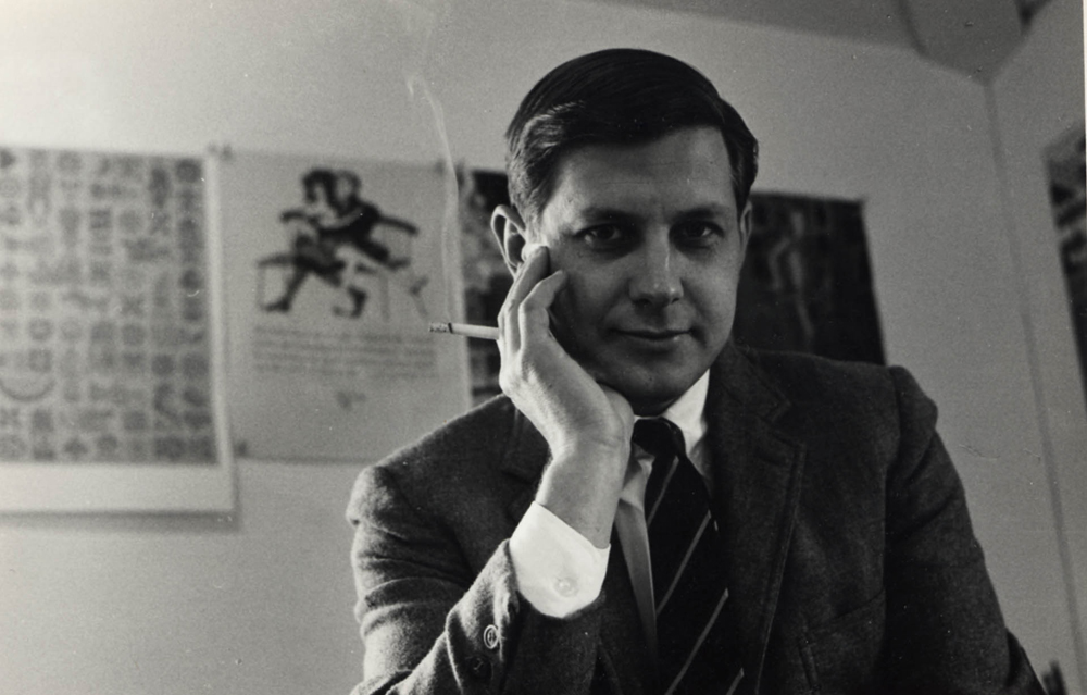
With characteristic modesty, my father liked to think of himself as a merry craftsman. The joy he derived from the practice of his craft often took the form of spirited whistling—whistling that would resonate throughout his studio, and beyond. He was especially content when applying color—particularly his medium of choice, watercolor. More often than, however, not he was silent, lost in thought. The combination of aesthetic and formal problems he so artfully juggled and solved required his undivided attention. Invariably this concentration would reach its feverish pitch three quarters into the final job, at which point he would take a couple push pins and vigorously pin his work in progress to his studio wall. Then he would step several feet backwards. From that vantage point he would contemplate (and judge) his work while smoothly drawing a hand, invariably attached to a cigarette, across his chin, for what seemed like ages—especially to the impressionable eyes of a child.
Looking back, I can see that his death, paradoxically, coincided with a birth—that of the digital revolution (“digital” may be something of a misnomer, considering the diminished role that the fingers may play in the creative process spawned by said revolution.) For better or for worse, we now live in a world that he might no longer recognize. My father’s approach to his work was in essence artisanal; at its root lies a highly sensitive eye-mind-hand coordination. The unbridled fondness he had for all that is hand-made assured that virtually every aspect of his craft—even the least illustrative and most technical aspects of his work, e.g. the setting of mechanical typography and related disciplines—exudes a warmth that is at odds with the technology-driven sensibilities of our age. I shudder to think of what my father would have made of a computer mouse, much less a Wacom tablet. As an artist he used all his senses: the hands-on nature of his working habit, his love of artists’ materials and his appreciation for tactile qualities, ensured that there be no mechanical divide between the work itself and the mind and hands creating it.”
The man who whistled was nevertheless a subtle character, a man in pursuit. Although born under the sign of Aquarius, and arguably the most elegant progenitor and practitioner of that seminal 1960s style commonly known as “Psychedelic”, by the late sixties he found himself in search of a “more terrestrial world, one with a tighter connection to the ground”—a return to some form of reality” reminded Stephen. This impulse is what led him to trace his roots back to Piedmont, Italy, and to eventually to relocate with his wife, Phyllis, and four boys, Thomas, John, Stephen and Kenneth, to Florence, Italy. As the conference unfolded, his picture of John became more and more alive with tactile details:
- Unbridled fondness for all that is hand-made
- Sensitive eye-mind-hand coordination
- Love of artists’ materials
John Alcorn was a craftsman of the highest order. An attitude that shined to the fullest during his Italian tenure, when the artist took on watercolors and played Mr. Understatement claiming he had “no time for more complicated techniques”—a statement belied by the sheer variety of techniques, mediums and styles employed throughout the course of his life. It is not beside the point to note what brand he employed, it is History and Geography, for as far as both subjects are concerned Alcorn was never uprooted from the here and now. You might call his forward curve “evolution by design” and that very formula underlies an extensive essay Stephen wrote (and titled as such) for the academic journal Bibliologia, about John’s life and art. Perhaps we can think of John Alcorn’s psychedelic side as well as his appreciation for all things solid and terrestrial, two hemispheres belonging in the same world.
The painting chosen as the poster for the conference at the University of Milan itemizes that Creativity-meets-Reality connection.

Three years ago, a young researcher was spending full days inside the Rizzoli vaults and querying Enzo Aimini, an executive at the Graphic Department, on Alcorn’s diehard passion for every single detail. This is a little sneak-peek of what John did: “He used to master the space between typefaces, master the letraset size, master font size—everything. He would experiment with the three inks of color printing to obtain blurs and halfshades”.
That young researcher is Marta Sironi. She works at the University of Milan’s Apice, an archive that hosts some of the best and the brightest in Italy’s publishing slash design scenario.
Last autumn, Sironi got to know Luigi Brioschi – president of Guanda and editorial director of Longanesi, both brands part of John Alcorn’s logo portfolio – in person, the full day he spent at Apice. He had good reason for such a long visit: the Alcorn Archive had just flown back to Italy.
Act II
Second coming
The arrival of the Alcorn Archive was possibly the quickest call-and-response tale in archive history and Marta played a significant role; the funny thing is chance also played a part. Here is a backstage pass to the plotpoints:
- 2009: it’s the 60th anniversary of Rizzoli’s BUR
- A collective, commemorative volume is scheduled
- Sironi starts researching an essay on BUR’s covers
- She surfs the web to The Alcorn Studio & Gallery
- Sironi writes to Stephen Alcorn for essay details
- Stephen Alcorn responds at length, and does so in Italian, much to Sironi’s delight and great relief
- Stephen considers Sironi’s interest in his father’s work to be heaven sent
- One thing leads to another; soon Stephen and Marta discuss the possibility of an Alcorn Archive
- Wouldn’t it fit perfectly in a top-notch institution?
- The collective volume on BUR is meantime published, replete with several previously unpublished images, courtesy of The Alcorn family
- In March of 2010 Stephen and his wife, Sabina travel to Milan to visit Apice in person
- Mid summer 2010: Marta Sironi travels to meet the artist’s wife, Phyllis and son, Stephen at Stephen and Sabina’s homestead and studio in Cambridge, NY, where John Alcorn’s oeuvre has been lovingly housed and archived since his death in 1992
- Total time available: one week
- 140 boxes’ worth of material must be inventoried
- Marta and Stephen work around the clock
- Fall 2010: the Alcorn Archive touches down in Italy
- Mission accomplished
That’s the way it went. What happened to Luigi Brioschi anyway? Believe it or not, he time-traveled.

“John Alcorn’s cover arts had an inventive quality, they weren’t just merely descriptive”: this sentence is a highlight point of the conference held at the University of Milan, on November 23rd 2011, and it belongs to Luigi Brioschi. The event was a sort of homecoming for him, too, since he had seen each and every playful visionary (his own words) item John had sent to production. As a matter of fact, Brioschi closely worked in the 70s at Rizzoli with the man who played Maecenas to the American artist: Mario Spagnol.
The story of the Spagnol-Alcorn legacy is another example of chance at its finest.
Legend has it a young John Alcorn just arrived to Italy toured the country’s biggest publishing houses in search of job opportunities. Of course Mondadori was on the radar. It was there and then that John chancely met another young man like him, an editor just five years his senior who had noticed Alcorn’s work for Pushpin Studios at a recent exhibition: Mario was eager to take a new challenge at Rizzoli, would John join?
That sparked the collaboration.
Several decades on, it is nearly routine to remind the Spagnol-Alcorn team revamped Rizzoli and changed the face of books, almost self-explanatory to use flashy terms such as art direction, corporate identity, brand image.
But it was no easy ride.
The thing is re-styling beats mere styling: it’s harder.
It’s about going where someone else was, before you.
Just imagine: you’re a young artist and you’ve been given the chance to tailor a brand new dress for a publishing behemoth.
Responsibility. Ambition. Pressure. Dreamscapes.
Now put yourself in context until you see the big picture:
| Brand | Restyling | Artist | Age | Year |
|---|---|---|---|---|
| Mondadori Oscar | Design | Giacomo Callo | 45 | 2009 |
| Penguin | Logo | Jan Tschichold | 44 | 1946 |
| Feltrinelli | Logo | Bob Noorda | 39 | 1966 |
| Rizzoli BUR | Design & Logo | John Alcorn | 38 | 1973 |
| Penguin Crime Books | Design | Germano Facetti & Romek Marber | 36 and 37 | 1962 |
Stephen Alcorn remembers “many antique booksellers across Italy started to deck their shopwindows with John’s latest creations”. Anyway feedback for the man who was central to the opening titles of so many Fellini movies was not right away 100% enthusiastic; the most traditional sellers were initially shocked by such an unconventional approach to book cover design.
It is not hearsay. I heard Luigi Spagnol, the son of Mario, say it. He also said: “We almost took John Alcorn for granted”, during the conference at the University of Milan. What did he mean? I guess he was thinking about nowadays.
Act III
Breakaway
We live in interesting times. These are the days of the “buyers”, the days when leaves and ships score high in the bestsellers charts: would Alcorn ever conceive such art? Hard to say. What’s for sure is he was a man of other leaves and other ships.
And yet he was no alien in planet Marketing.
Stephen Alcorn’s keynote speech at the University of Milan replayed John’s Florentine days as a “marriage between decoration and design, between trade and applied arts”. The union lasted well beyond that era and his Book Club portfolio is a showcase of that peculiar trade-art wedding: John was able to dress fiction and nonfiction and bestsellers and lose not an ounce of quality.

Luigi Brioschi says Alcorn has you wanting to publish his covers once and again.
Luigi Spagnol says his art has you thinking about Wolfgang Amadeus Mozart or Gaius Valerius Catullus.
Marta Sironi says his seminal Books! is going to be reissued for the 50th anniversary, in September of 2012.
Stephen Alcorn says John believed in the notion of progress in art.
John himself said: “My design is a breakaway from madness”.
But now it’s back in Italy.
A sort of homecoming.
Stefano Scalich – Nonfiction Editor
[Stephen Alcorn and Marta Sironi extensively cooperated with the author of this feature]
Position the cursor on the images to view captions, click on images to enlarge them.
Posizionare il cursore sulle immagini per leggere le didascalie; cliccare sulle immagini per ingrandirle.
Related Posts

The Author
1 Comment
Un artista necessario ma dimenticato. Ripescato dall’oblio con grande sensibilità. Non banale.