“WATT SENZA ALTERNATIVA”: A MATERIAL UNIVERSE IN A DIGITAL WORLD

“WATT SENZA ALTERNATIVA”: A MATERIAL UNIVERSE IN A DIGITAL WORLD
Welcome to the Retro Future, forget the age of PDF literature and ditch your e-whatever: come gather ‘round, all you “craftmanship perverts” still in love with the magic of ink-on-paper… but watch out. This is a stereo ride where writers might behave as illustrators (and vice-versa) because nothing is ever black or white. It is black, white, and red. Discover the steam engine that chose not to be digital: it comes in volumes, it comes in a tactile dress outrageously akin to vinyl, and it comes from Italy.
–WATT’s agent provocateur Maurizio Ceccato meets Stefano Scalich [*]
What’s WATT or (if you prefer) WATT’s WATT?
No alternative; no chains; no preservatives; no frills and a wild bunch of lines plus dots plus typings plus jottings… you asked for it and now you got it: WATT’s WATT!
Wait, wait: the stories are written in Italian, not English. Or do I have to infer non-Italian authors are also welcome?
Why not? Proposals are welcome: this is one world, and full of translators.
Two more straight shots: why a magazine and why printed on paper?
First of all, this is a hybrid, a book-magazine coming in volumes (no issues!) and weaving together a chorus of distinct personalities. Secondly, Ifix and Oblique Studio – the brains behind WATT – literally worship paper. And I mean printed paper. No digital artifact can give you that feeling. So don’t go looking for Digital Paper Smell—you won’t find it anywhere.
Aren’t you afraid of being a tad outcast? I mean, everyone today is so focused on e-books and digital magazines and price-containment ventures and you…
… and so what? Mind you: there are large armies of guys with a paper soul. Guys who are not 100% satisfied when they skim through blogs and videos staring back at them from idiotic real-time-follow-you-wherever screens; guys who cherish (and crave for) “that tactile feel”, that retro feel.
There is a vast and still unchartered territory of people deeply in love with stickers and xerocopied zines and whatever stays on a piece of paper. I’m sure we will meet them at the 2011 Turin Book Fair: Hall 2, stand J38. These people want to keep on cherishing those things tomorrow, in the Retro Future.
And I take it there’s a market in that Future
This is already the Retro Future. This is an excellent time for Drawings & Type, taken as a whole and printed on paper. Restaurant menus are more enjoyable on cardboard, I am told. Also, leaflets and promocards are in good shape and vinyl is practically booming.
Why so?
Sure shot: true browsing is the reason.
Come on, you just blamed the web!
Browsing comes in two blends: online browsing and true browsing, which is the side WATT stays on. True browsing does and always will happen on paper, not after paper. True browsing gives you the ability to discover details and pause, then start again and pause again, at any page you like and at any stage you like, again and again; in an everlasting chain of fingertip wonder requiring no battery at all.
Let us browse an array of possible ancestors. McSweeney’s, n+1, Reader’s Digest: what sets you apart from those and maybe a lot more periodicals?
I am Italian, so I would like to pay homage and tribute where homage and tribute are due: Graffa, G.I.U.D.A., Stranedizioni—all those people were “pervertly in love with craftmanship” just like Germano Facetti (most likely) was.
They are the true, unsung, ancestors.
Because they all treasure the same love for tactile look-and-feel WATT has. And that’s what matters to the “craftmanship perverts” nurturing this venture now: that is, Leonardo Luccone and me.
I think I saw you two somewhere else
Manual skills have been at the core of our collaboration from Day One. We love to literally put our hands on every possible process in the backstage of art creation. Yes, it can be demanding. But it’s so full of secret stories and simple magic. We enjoy collecting lots of types and drawings, lots of jottings and voices (oftentimes raging in the realms of the underground), and then weave them into a whole. If you don’t have a craftman’s attitude, your yin and yangs are destined to be lonesome twins.
Care to elaborate?
Well… let’s say PDF stole a little bit of charm out of literature. Good old ink on paper, on the other hand, is the true formula that keeps everything glued together. And you know one thing? That’s precisely entertainment, in the most etymological sense: from the latin “intra tenere”, keep inside, keep connected without sacrificing (hopefully) fun.
You reminded me a quote from some scientist: he pointed out that most important discoveries were not made by men thinking “this is correct”; they thought “this is funny”
Scientists and artists operate on the same wavelength: they perform trial and error sessions all the time and finally come up with a synthesis for the whole. A short formula. The shortest the formula, the better: WATT is black and white and red—no alternative.
So simple?
You must be, if you want to stay remembered. WATT’s simple equation is: 1 writer + 1 artist = double pages.
Tell me something about James Watt
He is our beloved demon. His spirit surfaces every now and then, through the pages of WATT. You can browse the pages and imagine this man – this discoverer – wandering through a paper museum of weird devices, retro devices, seeping through columns of type imitating the exotic language (a universal language: like literature) of strange machinery. It’s like contemplating a Morse telegram made of ON and OFFs, a circuit diagram of unutterable subplots, an imaginary catalog of possibilities.
Last but not least, James Watt is the inventor of powerful, inspirational quotes.
Share one with the literary community
Steam is the first example of God submitting to Man.
More about inventors and discoveries: have you and Luccone already put to test your scouting abilities?
I think I have a fitting example from Volume #Zero. The real story of Luciano Funetta’s story begins with Maurizio L’Altrella, a painter, who had a set of illustrations just ready: Luccone and I used them to inspire the forthcoming type engaging L’Altrella and Funetta in a sort of alchemical procedure. Funetta literally stared at those paintings for hours on end and then reworked them into a narrative. So there you have it: type and art, right and left, true stereo for the eye.
Please, tell me it’s in vinyl!
Definitely vinyl. WATT is the vinyl of literature.
It’s good to hear, because this Funetta-L’Altrella experiment might open more B-side scenarios to the classic writer/illustrator routine. Are you planning to publish writers behaving as illustrators and vice-versa?
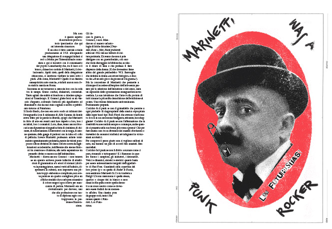
The door’s already been opened. WATT Volume #Zero proudly presents Pablo Echaurren, an artist mostly known and regarded as a visionary painter/illustrator yet little praised as a narrator. Which he is too, indeed he is. And he proves it with a poignant story mixing a palette of carefully selected echaurrenian themes: punk, the Ramones (he wrote a book about them) and the Futurists. You mentioned vinyl, before, and I can tell you Marinetti was a punk rocker makes for a blasting quadraphonic experience.
Dare I say WATT is more than meets the eye? The table of contents in the first iss… er, volume, lists such renowned young writers as Emanuele Tonon and Alcìde Pierantozzi
WATT welcomes any kind of fresh contribution, that’s why Luccone and I are very proud of those two you picked. The first is a preview from Tonon’s forthcoming new novel, while Pierantozzi’s story is the longest, hence an ideal closing to our 112 pages volume. It’s been inspired by the Chernobyl disaster, which happened exactly a quarter century ago: you see, it’s not true that paper is fading out of time.
Now that I notice, Volume #Zero features a gigantic red dot on an otherwise blank cover. It’s so reminiscent of 2011 Japan
If you like.
Time for the Time Machine. Gone are the bestsellers of the 80s, gone are the pulp of the 90s and (mostly) gone are the glossy vampires of the 00s: what are we going to experience – both graphically and textually – in the decade to come?
I have a feeling we will be enjoying more of what’s in WATT’s mission: things with a low-fi approach to technology; things which are down and dirty.
The Devils’ Advocate would tell you there is far more enjoyiment to come in digital
And Neil Gaiman would tell you one single image has the power to hold some 50 pages’ worth. Digital or not-digital, the question comes from elsewhere: does your non-textual apparatus have “that exhilarating feeling”? Take an illustration, a true illustration, for instance: it can be tiny, space wise, still it has the ability to shed light on what is not being told between the lines of a narrative (what critics call “subplot”) and become meaningful, powerful, for that precise reason.
That’s real power…
That’s actually what the WATT unit defines…
… and that power’s exactly what makes a narrative unfold
It is also what you do every time you open a magazine. Ergo, regardless of media, an illustration acts as a java popup on a piece of paper, an extra Dvd to the main flow of type, a B-side to the storytelling, a bass-booster punched on a recorder.
Just rewind it for a while, now. When did you start illustrating and drawing as a job?
I began freelancing for a wide palette of book and magazine publishers in 1994 (I’ve fond memories of editorial offices and lots of zigzagging around desks) and back then the ultimate hype advertised the “soon-to-be-born-overhead-free-portable-technology”—the computer: a saucerful of photomontage, photoretouch and photofuss, in my humble opinion.
Let me guess… you were an alien, a material guy in a digital world
I felt it right away. The moment I entered those places, I knew I had no alternative. I was carrying huge stacks of paper, xerocopies of handmade sketches, my coloured sketches. Every little one of them had that classic “dirty” feel only paper can exude… and you know what? I smuggled them as computer-generated: otherwise, I wouldn’t have sold and/or gotten the job.
The tables have turned on you now, what does an author need to interest WATT?
The call for papers reads “Cerchiamo segni poco visti o per niente visti” [translation: “We are looking for signs seldom seen or not seen at all”].
Time’s up: what do you want to do when you grow up?
Get our readers high on ink.
[*] Editor, translator and writer Stefano Scalich lives in Milan (he has no alternative).
Coda & specs:
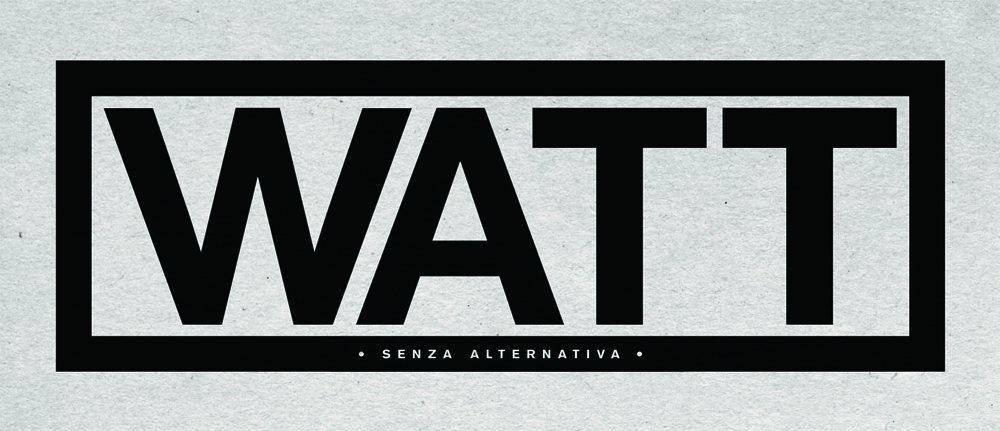
WATT – Senza alternativa
Volume zero
Ifix – Oblique Studio
Pages: 112
Format: 34,5×23,7 cm
Price: euro 9,00
Isbn: 978-88-905631-0-2
http://www.wattmagazine.it
In stores: May 12th 2011
Position the cursor on the images to view captions, click on images to enlarge them.
Posizionare il cursore sulle immagini per leggere le didascalie; cliccare sulle immagini per ingrandirle.

“WATT SENZA ALTERNATIVA”: UNIVERSI MATERIALI IN UN MONDO DIGITALE
Benvenuti nel Retro Futuro, scordatevi l’era della letteratura in PDF e buttate via qualunque e-qualcosa: venite a raccolta, tutti voi, “pervertiti dell’artigianato” che avete ancora un debole per quella magia chiamata inchiostro-su-carta… ma attenti. Questo è un viaggio stereo dove gli scrittori possono fare anche gli illustratori (e viceversa) poiché nessuna cosa è mai o bianca o nera. È bianca, nera e rossa. Venite a scoprire la macchina a vapore che non volle diventare digitale: fa volume, fa uso di una veste tattile tremendamente simile al vinile e fa base in Italia.
–L’agent provocateur Maurizio Ceccato parla di WATT: intervista raccolta da Stefano Scalich [*]
Cos’è WATT o (se preferisci) WATT’s WATT?
Senza alternativa. Senza catene. Senza conservanti. Senza paratesti ma con molti-molti segni… tu l’hai detto e tu l’avrai: WATT’s WATT!
Un attimo: le storie però sono tutte scritte in italiano. Sono dunque esclusi i contributi non-italici?
Tutt’altro. Ogni proposta è benvenuta: in fondo questo è un paese libero (e ricco di traduttori).
Due cose a colpo sicuro: perché una rivista e perché una rivista su carta?
Prima cosa: quella che hai di fronte è una creatura ibrida, una rivista-libro cadenzata in volumi (nessuna “uscita”) e che mette insieme un coro di talenti variegati. In secondo luogo, Ifix e Oblique Studio – ovvero i macchinisti dentro la macchina di WATT – hanno un’autentica venerazione per la carta. E quando dico carta, dico carta stampata. Non è ancora nata nessuna risorsa digitale che sappia trasmettere il medesimo feeling. Dunque non affannarti troppo a cercare qualsivoglia fantomatico Odore di Carta Digitale—non c’è.
Non avete un po’ paura di uscire dai giri? Voglio dire, coi tempi che corrono l’editoria si sta sempre più focalizzando sugli e-book e le riviste elettroniche e il contenimento dei costi e…
… e allora? Bada bene: esistono ancora interi eserciti di persone devote alla carta. Persone che non sono totalmente appagate da un quotidiano cincischiamento su blog e video i quali ricambiano i loro sguardi inespressivi da schermi ultra-portatili-ovunque-e-in-tempo-reale; persone che apprezzano (addirittura pretendono) “la sensazione tattile” e il nobile gusto retro collegato alla medesima.
Esiste un continente ancora molto inesplorato e popolato da persone innamorate degli adesivi, delle fanzine fotocopiate e di qualsiasi cosa abbia cittadinanza su un pezzo di carta. Sono sicuro che ne incontreremo svariati esemplari al Salone del Libro di Torino edizione 2011: siamo al Padiglione 2, stand J38. Sono queste le persone che apprezzeranno quelle cose, nel Retro Futuro.
Un Futuro in cui presumo esista un mercato
Il Retro Futuro è già cominciato. Questo è un ottimo periodo per la dicitura Testo & Illustrazione, intesa come coppia e stampata su carta. I menù dei ristornati (mi si dice) sono più belli qualora stampati su cartoncino. Anche i volantini e le promocard stanno attraversando un buon momento di popolarità, mentre il vinile è addirittura esploso.
Come mai?
Colpo sicuro: questione di browsing.
Ma se hai appena criticato il web!
Esistono due razze di browsing: il browsing online e il browsing primigenio, che io affettuosamente chiamo “lo sfoglio” e che è il versante presidiato da WATT. Lo sfoglio avviene e avverrà sempresu carta e non dopo la carta. Lo sfoglio ti dà l’opportunità di scoprire dettagli sempre nuovi e magari poi fare pausa, quindi ripartire e fare una nuova pausa, qualunque sia la pausa e la fase di lettura, ancora e ancora; in un ciclo continuo di meraviglie tattili che tra l’altro non hanno bisogno di alimentazione elettrica.
E allora sfogliamo un elenco di possibili antenati. McSweeney’s, n+1, Reader’s Digest: che cosa vi distingue rispetto a questi (e probabilmente a molti altri) illustri modelli?
Da italiano preferisco tributare omaggio ove è doveroso: dunque ricordo Graffa, G.I.U.D.A., Stranedizioni—tutti “perversamente innamorati dell’artigianato” tanto quanto lo era (molto probabilmente) un certo Germano Facetti.
Ecco: questi sono i veri, e misconosciuti, antenati.
Perché è tutta gente capace di valorizzare l’amore per l’esperienza tattile che caratterizza anche WATT. Ed è precisamente la stessa attitudine che caratterizza i “pervertiti dell’artigianato” dietro a questa iniziativa, adesso: ovvero, Leonardo Luccone e il sottoscritto.
Mi sa che vi ho già visti anche altrove
Già, infatti la cura per la manualità è sempre stata al centro della nostra collaborazione: fin dall’inizio. Ci piace mettere letteralmente le mani su qualunque processo abiti nel backstage della creazione artisitica. Può essere faticoso, è chiaro. Però ti regala storie segrete e magia pura. Noi ci divertiamo a raccogliere molte parole e illustrazioni diverse, molti segni e molte voci (spesso confinate nelle segrete dell’underground) per poi ricucirle in un insieme coerente. Senza uno spirito da artigiani, tutti quegli yin e yang rischiano di rimanere gemelli solitari.
Che tradotto significa?
Beh… diciamola così: il PDF ha tolto un po’ di fascino alla letteratura. Il buon vecchio inchiostro su carta, invece, è l’autentica forma capace di incollare tutto e di tenerlo saldo. E poi la sai una cosa? Quello è il preciso significato della parola intrattenere, proprio nel senso etimologico: dal latino “intra tenere”, tenere dentro, tenere tra, stabilire una connessione senza sacrificare (ci auguriamo) il divertimento.
Mi viene in mente la frase di uno scienziato che faceva notare come molte importanti scoperte non fossero arrivate da gente sorpresa a pensare “questo è corretto”; invece pensavano “questo è divertente”
Scienziati e artisti si muovono sulla medesima lunghezza d’onda: sono artigiani impegnati in un’attività di sperimentazione continua e alla fine se ne escono fuori con una sintesi per il tutto. Una formula breve. Più la formula è breve e meglio è: WATT è nero, bianco e rosso—senza alternativa.
Non sarà troppa semplificazione?
Meglio avercela, se vuoi che si ricordino di te. L’equazione di WATT è semplice: 1 narratore + 1 illustratore = doppia pagina.
Parlami un po’ di James Watt
È il nostro demone protettore. Il suo spirito affiora ogni tanto, dalle colonne di WATT. Mentre sfogli le pagine puoi immaginarti quest’uomo – questo inventore – che si aggira in un museo cartaceo dove sfilano strani marchingegni un po’ retro; puoi immaginartelo emergere in mezzo a tutti quei testi che ricalcano il linguaggio (universale: come la letteratura) delle apparecchiature scientifiche. È un po’ come starsene là a contemplare un telegramma composto di ON e OFF in alfabeto Morse, o uno schema tecnico di inconfessabili sottotrame, o ancora un immaginario catalogo di possibilità.
Last but not least, James Watt è stato anche l’inventore di frasi piuttosto ispiratrici.
Condividine una con la comunità letteraria
Il vapore è il primo esempio di Dio che si sottomette all’Uomo.
Restiamo in tema di inventori e scoperte: tu e Luccone vi siete già messi alla prova in termini di scouting?
Ho un esempio calzante proprio dal nostro Volume #Zero. La vera storia dietro alla storia di Luciano Funetta comincia con il pittore Maurizio L’Altrella, che ci aveva mandato un gruppo di illustrazioni già pronte: Luccone e io le abbiamo usate per ispirare la storia nascitura, coinvolgendo L’Altrella e Funetta in una specie di opus alchemicum. Funetta è rimasto a fissare quei dipinti letteralmente per delle ore e poi li ha rielaborati creando una narrazione. E quindi eccoci qua: testo e immagini, destra e sinistra, un’autentica esperienza stereo per gli occhi.
In vinile, spero!
Assolutamente vinile. WATT è letteratura al vinile.
Buono a sapersi, perché questo esperimento Funetta-L’Altrella potrebbe aprire degli ulteriori scenari, altrettanti lati B nella classica line-up illustratore/scrittore. Avete intenzione di pubblicare scrittori che fanno gli illustratori e viceversa?
La porta è stata già aperta. WATT Volume #Zero è orgoglioso di presentare Pablo Echaurren, un artista visionario universalmente noto come pittore/illustratore eppure meno noto come narratore. Cosa che invece è, eccome. E lo dimostra con un testo dove mescola una tavolozza selezionatissima di temi squisitamente echaurreniani: il punk, i Ramones (su di loro ha scritto anche un libro) e i futuristi. E visto che poco fa abbiamo parlato di vinile, posso dirti che Marinetti was a punk rocker è potenza quadrofonica allo stato puro.
Oserei dire che WATT è più di quanto salta all’occhio. Nell’indice della prima usc… ehm, volume, si fanno ricordare i nomi di due giovani scrittori come Emanuele Tonon e Alcìde Pierantozzi
Dentro WATT ogni contributo fresco è il benvenuto e quello è il motivo per cui Luccone e io siamo piuttosto orgogliosi dei due che hai appena citato. Il primo è un’anticipazione del prossimo romanzo di Tonon, mentre il racconto di Pierantozzi è il più lungo in tutte e 112 le pagine del volume. Tra l’altro, è ispirato all’incidente di Chernobyl, che se non sbaglio si verificò esattamente un quarto di secolo or sono: dunque non è così vero che la potenza della carta svanisce nel tempo.
Ora che ci penso, sulla cover “nuda” del Volume #Zero campeggia anche un enorme bollo rosso. Il link con il Giappone nucleare del 2011 è fortissimo
Ognuno può vedere il link che vuole.
Facciamo un po’ di macchina del tempo. Sono passati i bestseller degli anni ’80, i cannibali dei ’90 e i vampiri patinati degli anni ’00: per che cosa verrà ricordato, in termini grafici e testuali, questo decennio che si apre?
Mi sa tanto che vedremo sempre più cose in sintonia con la vocazione di WATT: cose che hanno un approccio lo-fi alla tecnologia; cose che hanno il gusto dello sporco.
Ma l’Avvocato del Diavolo ti direbbe che le possibilità più divertenti arriveranno in forma digitale
E Neil Gaiman ti direbbe che una singola immagine ha il potere di riassumere 50 pagine scritte. Digitale o non-digitale, la vera domanda punta altrove e cioè: d’accordo, hai un apparato non-testuale, ma quell’apparato sa trasmettere un feeling “eccitante”? Prendi per esempio un’illustrazione, una vera illustrazione: può anche essere minuscola, in termini di spazio, ma ha comunque la capacità di gettar luce su ciò che non viene detto tra le pieghe di un racconto (gli esperti lo chiamerebbero “subplot”) ed è proprio per quello che acquista significato e potenza.
Quella sì che è potenza…
Che ha anche un’unità di misura: il WATT…
… ed è la medesima potenza che permette a una narrazione di snodarsi
Non avviene forse tutte le volte che sfogli delle pagine? Ergo, a prescindere dai media, un’illustrazione si comporta come un popup java su un pezzo di carta, un extra nel Dvd del testo principale, una B-side del racconto, un pulsante per accentuare i bassi su un registratore.
E allora riavvolgiamolo per un po’. Quando hai iniziato a fare l’illustratore per lavoro?
Sono partito come freelance per diversi editori, sia nella stampa periodica che in quella libraria, nel 1994 (i classici ricordi con le redazioni e il sottoscritto che fa zigzag in mezzo alle scrivanie). A quel tempo tutti parlavano o, meglio, si riempivano la bocca con la nascitura “tecnologia portatile scacciapensieri” ovvero il computer e i suoi miracoli di fotomontaggi, fotoritocchi e fotointrugli (modesto parere).
Lasciami indovinare… eri una specie di alieno, un ragazzo materiale in un mondo digitale
Sì, l’ho capito subito. Nel preciso istante in cui sono entrato in quei posti ho capito di essere senza alternativa. Avevo sottobraccio enormi blocchi di carta e fotocopie di bozzetti, i miei bozzetti, ognuno aveva quel classico aspetto “sporco” che solamente la carta può regalarti… e indovina un po’? Li spacciavo per bozzetti fatti al computer: altrimenti non mi avrebbero accettato il lavoro.
Ora che certe parti si sono invertite, cosa chiederesti a un aspirante autore di WATT?
Ti recito testualmente l’annuncio che abbiamo messo su Internet: “Cerchiamo segni poco visti o per niente visti”.
Tempo scaduto e ultima domanda: cosa volete fare da grandi?
Ubriacarvi d’inchiostro.
[*] Editor, traduttore e scrittore, Stefano Scalich vive a Milano (è senza alternativa).
Coda & specifiche tecniche:
WATT – Senza alternativa
Volume zero
Ifix – Oblique Studio
Pagine: 112
Formato: 34,5×23,7 cm
Prezzo: 9,00 euro
Isbn: 978-88-905631-0-2
http://www.wattmagazine.it
Nelle migliori librerie amiche: 12 maggio 2011
Related Posts

The Author

1 Comment